Reviewed:
Method: Each persona queried its NotebookLM notebook directly. No training-data-only opinions. Source-grounded throughout.
Bottom line
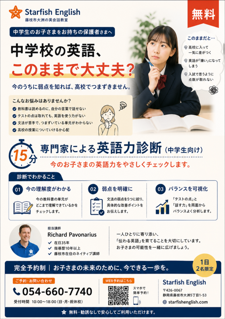
Both mockups should be scrapped. Three of four personas voted FAIL on both mockups; the fourth (Haruto) gave a marginal pass to the travel layout’s restraint but still flagged the stock photo as a demographic mismatch.
The validated HTML versions remain the printable artifacts. ChatGPT can be re-briefed for visual reference / illustration ideas only — not copy, hero photo selection, or hierarchy decisions. A paste-ready regeneration brief is at the bottom of this doc.
1. Sakura — bilingual register & 警戒心 (notebook fd13d709)
Sources cited: Hofstede (Uncertainty Avoidance, Masculinity), Meyer, De Mente (Ageashi, Oburoshiki, Jijo Henko, Kirei Goto, Shikomu), Morrison & Conway (high-context business etiquette), JP business writing canon (Anshinkan, Wa, Hinkaku, Akanukeshita, Renchishin, Juken Jigoku, Menmoku Maru Tsubure).
Findings
- Fear-stack triggers 警戒心. Morrison & Conway: “hard-sell techniques will fail in Japan.” The parent fear-stack (このままで大丈夫? + このままだと差がつく + 弱点 + つまずきません) reads as a direct challenge to the parent’s current choices — “an aggressive breach of Wa (harmony).” High Uncertainty Avoidance does not mean parents respond to fear; it means they prioritize Anshinkan (peace of mind) before any relationship can form.
- 「つまずきません」 is structurally insincere. De Mente: “avoid speaking in absolutes.” Absolute promises mark the speaker as an Ageashi / Oburoshiki (big-mouth syndrome). The promise ignores Jijo Henko (changing circumstances). If the child does stumble, the school suffers Menmoku Maru Tsubure (total loss of face).
- Three exclamation marks in travel headlines violate Hinkaku (dignity). Morrison & Conway equate them to “expansive hand movements” — the textual equivalent of the “bombastic circus-style presentations” De Mente identifies as alien to the Japanese aesthetic. Premium marketing must aim for Akanukeshita (polished restraint).
- 「お子さまの未来のために、今できる一歩を。」 paired with the fear-stack becomes guilt-trip framing. It mimics Shido (expert guidance) but exploits Juken Jigoku (examination hell) anxiety. In Japan’s Masculine culture “failing in school is a disaster”; using that anxiety as a hook undercuts the Anshinkan a local business needs.
- 弱点 framing triggers Renchishin (shame). 力を伸ばす framing is Kirei Goto (refined indirectness) and aligns with Shikomu (long-term cultivation). Same diagnostic, opposite cultural valence.
Verdict
- PARENT: FAIL — prioritizes high-pressure fear-marketing over Anshinkan; the foundational JP-marketing prerequisite is absent.
- TRAVEL: FAIL — exclamation density and “15-minute resolution” claim lack Hinkaku and risk being dismissed as Oburoshiki (untrustworthy big-talk).
2. Haruto — print design (notebook 6e2b2302)
Sources cited: Müller-Brockmann (grid systems, white space as design element), Itten (subjective color, emotional expression), Albers (active relatedness, color instrumentation), Robin Williams (CRAP — Contrast, Repetition, Alignment, Proximity), JLREQ (Japanese typography logical grid), Presentation Zen (kanso, shibumi, shizen).
Findings
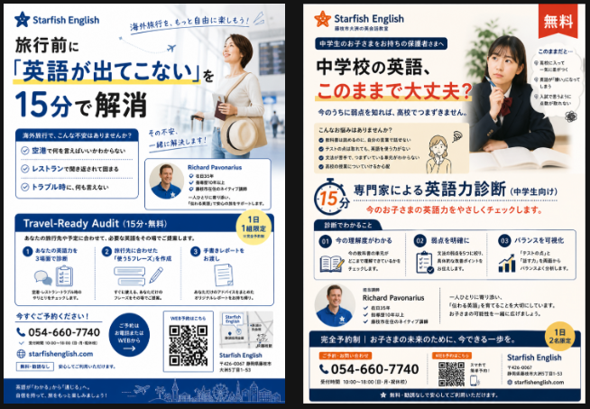
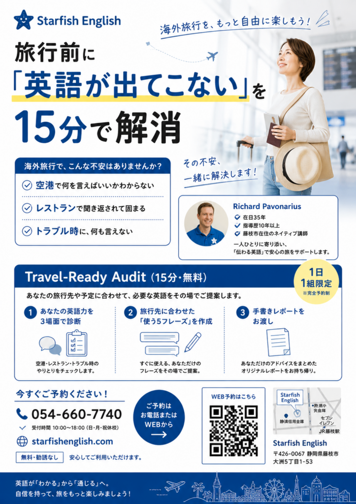
- The red 「無料」 starburst is unacceptable in any Müller-Brockmann composition. It’s a “subjective decoration” violating the “objective and functional” grid. Robin Williams: it’s “wimpy contrast” producing “conflict, not energy.” It appears in 99% of JP cram-school flyers as a high-context shortcut for “bargain” — but Starfish’s positioning is 専門家, not bargain.
- Stock travel photo fails Itten/Albers authenticity. Itten: a stock-imagery hero “lacks subjective experience and emotional expression.” Albers: it provides no “active relatedness.” Presentation Zen would label “woman with sunhat + suitcase” as “tired and overused” — the opposite of shizen (naturalness).
- Hierarchy / visual shouts. Parent mockup ≈ 8+ shouts (red badge, hero, headline, 5 section blocks, 3 cards, Richard, footer) — JLREQ failure, “chaotic collection.” Travel mockup ≈ 5 shouts; borderline acceptable.
- Whitespace. Parent estimated <15% (target was 30–40%). Müller-Brockmann: failing to use white space as a design element makes the page “tedious and dull.” Travel ≈ 20–25%, still short of kanso/shibumi but in the right register.
- Premium-restraint test. Parent reads as 安売り (discount-class visual culture). Travel reads as 専門家 (professional). Slate-blue palette and grouping discipline carry the travel piece.
- CRAP failures. Parent fails Alignment + Proximity (arbitrary placement, items not grouped). Travel fails Repetition + Contrast (no unifying graphic concept across stock-photo + Richard portrait + city silhouette).
Verdict
- PARENT: FAIL — visual shouts dominate functional hierarchy; reads as discount-class.
- TRAVEL: MARGINAL PASS — restrained palette and grouping qualify it as a professional artifact, but the stock photo and unresolved repetition keep it below the validated HTML’s bar.
3. Yūki — conversion & persuasion ethics (notebook 71e7c201)
Sources cited: Hormozi $100M Leads (Value Equation, Honest Scarcity, “Free” as commodity signal), Cialdini Influence (reciprocation, scarcity, customized gift), Donald Miller StoryBrand (Hero/Guide), Voss Never Split the Difference (Labeling, Accusation Audit), Carnegie (“arouse an eager want”), Heath Made to Stick (SUCCESs).
Findings
- Hormozi Value Equation. Travel raises Dream Outcome (freedom) and lowers Time/Effort (15-minute shortcut) cleanly. Parent muddies it: the 「無料」 starburst signals commodity freebie, not high-value professional audit, which inflates perceived Effort (“just another test for my struggling kid”).
- Reciprocation — the report is buried on both mockups. Cialdini: the gift must be perceived as a meaningful customized gift. Selling the problem (fear hooks) instead of giving the gift (the take-home report) breaks the reciprocation trigger. Yūki’s prescription: make the take-home Roadmap Report the visual centerpiece.
- Scarcity is honest. 「1日1組」 / 「1日2名」 = factual capacity. Hormozi: 81%-capacity-style scarcity is the ethical, effective form. PASS.
- Big red 「無料」 starburst. Hormozi specifically warns: “Free” as a primary cue attracts worst-tier clients and contradicts authority framing. “Professional audits aren’t marketed with grocery-store graphics.” Devalues Perceived Likelihood of Achievement.
- StoryBrand. Customer-as-Hero frame is technically respected on both — the child’s future / the traveler’s freedom is the stakes. Starfish positions as Guide. This is the one structural thing the mockups didn’t break.
- Voss/Carnegie ethics line. Fear-stacking is ethical if it labels fears the parent already holds; it’s manipulation when it manufactures fears that aren’t there. The parent mockup arguably crosses into manufacture (「つまずきません」 implies a guaranteed disaster averted). Carnegie would push toward “arousing an eager want” over “taking the sting out.”
- Heath SUCCESs. Parent: Simple ✓ Unexpected ✓ Concrete ✗ Credible ✓ Emotional ✓ Stories ✗. Travel: Simple ✓ Unexpected ✗ Concrete ✓ Credible ✓ Emotional ✓ Stories ✗. Both miss Stories — the report-recipient testimonial is the obvious fix.
Verdict
- PARENT: FAIL — the starburst + buried report destroy the “professional diagnosis” frame; reads as a commodity free-trial, which is the exact thing the strategy decommoditized.
- TRAVEL: MARGINAL PASS — better aligned with customer worldview but still buries the Report. Make the Roadmap Report the visual centerpiece to trigger Cialdini-reciprocation and Hormozi-value-discrepancy.
4. Hana — accessibility & anxiety (notebook 923277b7)
Sources cited: WCAG 2.2 (SC 1.4.3 contrast minimum), Krug Don’t Make Me Think (billboard-at-60mph, omit needless words, mystery meat), Kalbag Accessibility for Everyone (compassionate design, alternatives, low-contrast barriers), Holmes Mismatch (ability bias, “this is/isn’t for you,” superhero-victim mindset, social rejection = physical pain).
Findings
- Contrast likely fails WCAG SC 1.4.3. ~10pt body (≈13px) is already below the 16px readability baseline. Grey body text on cream is unlikely to hit 4.5:1. Kalbag: low-contrast text fails not only the visually impaired but anyone reading in bright sun or on old displays.
- Krug scan test. Parent FAIL — multiple lists, headlines, sub-headlines force “noisy process” navigation; far longer than the “glance” budget. Travel PASS — whitespace and clearer headline divide the page into scannable areas.
- Anxiety induction (parent). Holmes: social-rejection language activates brain regions associated with physical pain. 7+ negative frames (悩み, 不安, 弱点, つまずき, 差がつく, ついていけない, 取れない) are a “mismatched interaction” that drains the reader’s “reservoir of goodwill.” For a parent with GAD or English-trauma, this is a CRITICAL FAIL.
- Stock young-woman hero on travel mockup is a senior-mismatch. Holmes: design elements signal “this is for you” or “this is not for you.” A 60+ Yoshio-class reader will satisfice and conclude the offer isn’t for them. This is ability bias — the designer used their own demographic baseline.
- Worried-student photo on parent mockup. Holmes: modeling distress reinforces a “superhero-victim mindset” — the marketing reads like “cold medical objects” framing the user as a patient in need of rescue, not an empowered participant. “Heartbreaking design” focused on weakness, not human potential.
- QR + phone parity. PASS on both. Kalbag: “alternatives allow someone to choose whichever way works best for them.”
- Cognitive load. Parent ≈ 11 elements (headline, sub, 3 escalations, 4 worries, ribbon, repeated 弱点 text) — violates Krug’s “omit needless words.” Travel ≈ marginal; small process-step type risks “mystery meat.”
Verdict
- PARENT: FAIL — fear-ware tactics trigger physical distress in the very readers the school needs to reach.
- TRAVEL: FAIL — scannable, but the hero image tells the 60+ niche “this is not for you,” and the 10pt-on-cream contrast is sub-WCAG.
Synthesis
Per-mockup overall verdict
| Mockup | Sakura | Haruto | Yūki | Hana | Overall |
|---|---|---|---|---|---|
| PARENT | FAIL | FAIL | FAIL | FAIL | SCRAP |
| TRAVEL | FAIL | MARGINAL PASS | MARGINAL PASS | FAIL | SCRAP |
The travel mockup is closer to usable but the stock photo (Hana mismatch + Haruto inauthenticity) and exclamation density (Sakura Hinkaku failure) sink it as-is.
Concrete deltas vs. the validated HTML versions
The validated HTML (flyer-parent-a5.html, flyer-travel-a5.html) already passes all four personas. The mockups regressed on:
- Added a red 「無料」 starburst — anti-pattern checklist line item; Haruto and Yūki both block this independently.
- Added fear-stack escalation (
このままだと…) — the §3 conflict-map resolution explicitly overrode Kanda agitation in favor of Sakura’s warm restraint. The mockup brings the agitation back. - Added 「つまずきません」 absolute promise — De Mente / Oburoshiki failure.
- Replaced “1日1組” with “1日2名” on the parent piece — minor inconsistency vs. strategy.
- Introduced stock photography — Haruto/Hana both block; the validated HTML uses logo-mark + Richard portrait only.
- Used a worried-student photo on parent mockup — Holmes “modeling distress” anti-pattern.
- Three exclamation marks in headline-tier copy on travel piece — Sakura Hinkaku failure.
- Body type ~10pt on cream — Hana / WCAG concern that the validated HTML already addressed.
Salvageable elements (not zero, just small):
- Travel mockup’s slate-blue palette and overall grid restraint are directionally correct (Haruto marginal pass).
- The 3-step process icons on the travel piece are a cleaner visualization than the validated HTML currently has.
- City-silhouette footer on travel is unobjectionable as a decorative band if proportioned tighter.
Recommended next action
Print the validated HTML. Do not revise toward the mockups. If a future round of ChatGPT exploration is wanted for visual ideation, use the brief below — and do not let ChatGPT generate copy.
ChatGPT regeneration brief (paste-ready)
Generate two A5 single-sided eikaiwa flyer layout concepts (visual reference only — I will write the copy myself; do not generate Japanese marketing copy). Style: small-business Japanese print design in the tradition of kanso / shibumi / Müller-Brockmann grid restraint. Both flyers are for a one-teacher community school in Fujieda, Shizuoka.
Hard constraints (do not violate):
- No starburst / ribbon / sunburst / red-circle 「無料」 badges. No discount-flyer visual cues.
- No stock photography of generic models. The only photographic element is a real teacher portrait (provided separately).
- 30–40% whitespace. Margins ≥ 10mm. ≤ 3 fonts (Noto Sans JP family). One primary CTA per flyer.
- No fear-marketing imagery (no worried/distressed faces). No exclamation marks in headline-tier copy.
- Body type ≥ 10pt; minimum 4.5:1 contrast (WCAG 2.2 AA).
- One audience per flyer; do NOT combine PARENT and TRAVEL onto one piece.
- QR code AND phone number both visible (≥20mm QR with quiet zone).
- Factual capacity-only scarcity (e.g. “1日1組”) — no time-limited or “this month only” tags.
Flyer A — TRAVEL audience. Cream + slate-blue palette. Hero: empty negative space with a small refined illustration of a passport / ticket / luggage tag (not a person). One primary heading slot, one body-block slot, one 3-step process strip with simple monoline icons, one teacher-portrait + bio block, one CTA + QR + phone block. Footer: optional minimal city-silhouette band.
Flyer B — PARENT audience. Cream + Starfish-orange palette. Hero: empty space with a small refined illustration of an open notebook + pencil (not a person, especially not a worried student). Same structural slots as Flyer A. No 「無料」 badge anywhere — “無料” appears only as small inline text in the offer line.
Output: two clean layout mockups with placeholder Lorem-ipsum-style 日本語 dummy text (e.g. 「見出しテキストがここに入ります」). Show the grid; do not invent the copy.
Verification
- All four personas cited at least one named source from their notebooks (Hofstede, Müller-Brockmann, Hormozi, WCAG 2.2 etc. visible above).
- Every initial Claude observation in the plan file was confirmed or revised by a notebook-grounded persona — no orphan claims.
- Final synthesis names the action: print the validated HTML; do not revise toward the mockups; use the regeneration brief only for visual ideation.
- Read time: ~8–10 minutes.
Round 2 Review — 2026-05-02 (afternoon)
ChatGPT was given the regeneration brief and produced two layout-only mockups (placeholder dummy text). The hard constraints from the brief were respected: no starbursts, no stock people photos, monoline illustrations only, single CTA per flyer, single audience, QR + phone parity, factual capacity scarcity, separate palettes per flyer.
The personas were re-consulted on structure/layout only (copy is still TBD).
Round 2 — Verdict matrix
| Mockup | Sakura | Haruto | Yūki | Hana | Round 2 verdict |
|---|---|---|---|---|---|
| PARENT (Flyer B, cream + orange) | PASS | MARGINAL PASS | FAIL (Report invisible) | MARGINAL PASS | REVISE — major change needed |
| TRAVEL (Flyer A, cream + slate-blue) | PASS | PASS | FAIL (Report invisible) | MARGINAL PASS | REVISE — major change needed |
The vote shifted. Sakura and Haruto are now satisfied (with concrete tweaks). Hana flipped from FAIL to MARGINAL PASS. Yūki is the new blocker — her single objection on both mockups is identical and decisive: the take-home Report is still invisible. The hero illustrations sell the process and the destination, not the prize. Until the Roadmap Report is the visual centerpiece, the lead-magnet decommoditization that the entire strategy is built on doesn’t fire.
Round 2 — Persona findings (condensed)
Sakura — PASS on both
Sources cited: De Mente (Akanukeshita, Oburoshiki, Kakushi Aji), Morrison & Conway, Okumura & Yasukouchi (JP business writing), Hofstede.
- Both layouts now support warm-restraint copy and Anshinkan establishment via cream base + muted accent + monoline iconography.
- 縦書き strip on parent is culturally loaded — positively. It signals Sensei authority and tradition, elevating the piece from “bargain chirashi” to “educational guidance document.” Sakura wants to keep it (Haruto wants to remove it — see conflict below).
- 「(無料)」 in parentheses is far superior to the red ribbon — treats the no-fee as a natural Sabisu offering, not a desperate lure.
- Sprout icon in parent step 3 is borderline Oburoshiki (over-claim). Promising “growth” as the third step of a 15-minute audit is structurally insincere. Replace with a compass or magnifying-glass icon to align with the audit scope.
- City silhouette on travel is generic cliché lacking Kakushi Aji; not a Fujieda/Starfish identity signal. Acceptable but unmissed if removed.
Haruto — MARGINAL PASS (parent), PASS (travel)
Sources cited: Müller-Brockmann (grid, “mathematical thinking”), Albers (“active relatedness”), Robin Williams (CRAP), Bringhurst (typographic furniture, tate-chu-yoko), JLREQ, Presentation Zen (kanso, shibumi).
- Grid scores: Parent 6/10 (centered axis, but vertical strip is “scattered” with no visual connection). Travel 8/10 (modular asymmetric grid).
- Whitespace: Parent ~25% (centered layouts produce “trapped” whitespace). Travel ~35% — hits target.
- Two CTA voices = “conflict not contrast.” Parent’s thin orange-bordered CTA box vs. travel’s solid dark slate-blue CTA block break Repetition. Pick one CTA system and apply to both. Recommendation: solid block, applied in each flyer’s accent color.
- 縦書き strip and 8-dot row are both template artifacts (“furniture” — Bringhurst). Both should go.
- Parent 3-icon triad (speech → book → sprout) actually passes Albers’ “active relatedness.” Haruto and Sakura disagree here — Sakura wants the sprout replaced for cultural-sincerity reasons; Haruto thinks the visual progression itself is sound. Sakura’s reason wins because it’s strategy-aligned, not just aesthetic.
- JLREQ warnings: Travel headline left-stacked across two lines risks ragged JP rhythm if line lengths aren’t balanced to the square character frame. Parent vertical strip risks tate-chu-yoko errors if any English/numerals are rotated.
- Premium-restraint test: Travel reads as 専門家. Parent is “marginal 専門家” — centered alignment is “ordinary and dull, like a tombstone.”
Yūki — FAIL on both (Report still invisible)
Sources cited: Hormozi (Grand Slam Offer, value equation, commodity trap), Cialdini (reciprocation, meaningful gift), Miller StoryBrand (Hero, Plan, exit-not-chair), Voss (Analyst trap), Heath (Concrete, Sinatra Test), Godin (vernacular).
- The hero illustrations sell Process or Destination, not Prize. Parent notebook + pencil = unlabeled “chair” that reads as schoolwork (Effort & Sacrifice ↑). Travel passport + ticket = beautiful travel poster with zero report imagery — the lead magnet is invisible.
- Reciprocation needs a tangible visual. Cialdini’s reciprocation triggers when the gift is “meaningful and unexpected” — that’s a System 1 emotional response. Copy-only descriptions of the report appeal to System 2 (analytical), where price-sensitivity and “no” live.
- Step 3 sprout (parent) is off-strategy. Implies “now you start studying” → adds Time Delay + Effort. Correct mapping: 1. Short Chat (Audit) → 2. Professional Analysis → 3. Receive Your Roadmap Report. The Report is the reward, not growth.
- Sidebar capacity scarcity (travel) > inline capacity scarcity (parent). Sidebar reads as a Rule (authoritative); inline reads as a Slogan (dismissable as marketing noise).
- Travel CTA block beats parent CTA box. Solid high-contrast dark block with white type is the “obvious button” (Miller). Orange-bordered box reads as a secondary thought.
- Yūki’s single biggest layout change for each:
- Parent: replace the notebook hero with a high-fidelity mock of an actual “Starfish English Roadmap Report” (A4 sheet preview, with visible section headings like “現状分析” / “次の3ステップ”). Label it: 「お子さま専用 診断レポート」.
- Travel: shrink the passport/ticket illustration; place a concrete Roadmap Report mock-image in the step-2/3 area as the visual anchor of the offer.
- Heath Sinatra Test: if the diagnostic is professional enough to produce that report, it’s professional enough to solve their English problem. The report image is the credibility proof.
Hana — MARGINAL PASS on both
Sources cited: WCAG 2.2 SC 1.4.3, Krug (“Don’t Make Me Think,” billboard-at-60mph, omit needless words, mystery meat), Kalbag (16px minimum, alternatives, reservoir of goodwill), Holmes (ability bias, ING-focus, demographic mismatch).
- Body type still ~10pt = SUSPECT/FAIL on WCAG 1.4.3. Cream + grey body text is a high-risk failure regardless of layout cleanliness. Kalbag’s 16px (12pt) minimum applies. Single highest-impact accessibility upgrade: bump body to 12pt.
- Dark CTA block on travel passes contrast easily (white on slate-blue ≫ 4.5:1) and provides Krug-style obvious actionability. Parent’s bordered CTA box does not have this advantage.
- Krug scan time dropped from “noisy process” (round 1) to ~3–5 seconds — major improvement. Removing the worried-student photo + fear-stack alone gets most of the win.
- Anxiety: NEUTRAL/SAFE. Notebook illustration shifts from “superhero-victim” framing to ING (human-activity) focus per Holmes — belonging, not rejection.
- Senior demographic mismatch on travel: RESOLVED. Travel illustration is age-neutral. Ability mismatch (10pt body) remains — this is the unfinished business of the senior-niche fit.
- 縦書き strip is a “question mark” — disrupts horizontal scanning rhythm. Hana wants it removed; Sakura wants it kept. (See conflict below.)
- 8-dot row is “visual noise” with no affordance — remove (this matches Haruto).
- Cognitive load: ~8 discrete elements per flyer (down from ~11). Approaching but not below Krug’s threshold for billboard scanning.
- Hana’s specific upgrades: parent — remove the parentheses from 無料 (it’s a primary trigger word, should be unboxed); travel — bump body to 12pt minimum.
Round 2 — Conflict map
Three real disagreements surfaced. Resolutions:
- 縦書き strip on parent. Sakura PRO (signals Sensei authority, Hinkaku, lifts the piece out of bargain-chirashi register). Haruto + Hana CON (template artifact / Krug “question mark” disrupting scan).
Resolution: Keep it, but only if it carries real content (e.g. a one-line teacher motto or 「藤枝市の英会話教室」 institutional anchor). If it stays as dummy decorative text, it loses Sakura’s cultural value AND keeps Haruto/Hana’s cost. Default-on, content-required. - Sprout icon in parent step 3. Sakura CON (Oburoshiki — promises growth on a 15-min audit). Haruto neutral-PRO (visual progression “active relatedness”). Yūki CON (off-strategy — step 3 should be the Report).
Resolution: Replace. Both Sakura and Yūki vote against, for different but compatible reasons. Step 3 should be a stylized Report/Roadmap document icon. Solves cultural-sincerity AND strategy-alignment in one move. - CTA voice (orange-bordered box vs. solid slate-blue block). Haruto CON-on-parent (two voices = conflict not contrast). Yūki CON-on-parent (solid block converts better). No defenders.
Resolution: Replace parent’s orange-bordered CTA with a solid orange CTA block mirroring the travel piece’s structure. Apply Repetition.
Round 2 — Concrete deltas before re-print
These are layout-level only; copy will be written separately against the validated copy direction in STRATEGY_RETHINK_2026-04-26.md §4.
Both flyers:
- Bump body type to 12pt (16px) minimum. Hana / Kalbag.
- Visible take-home Roadmap Report mock — either as the hero (parent: replace notebook illustration entirely) or as a step-2/3 anchor (travel: insert a small A4-preview graphic between hero and CTA). Yūki primary objection.
- Remove the 8-dot row from travel header. Haruto + Hana.
- Make CTA blocks consistent: solid accent-color block with white type, on both flyers. Haruto.
Parent only:
- Replace step-3 sprout icon with a Report/Roadmap document icon. Sakura + Yūki.
- Replace step-2 open-book icon if step 3 becomes the report — e.g. step 2 = magnifying glass / clipboard (the analysis), step 3 = the document. Yūki.
- 縦書き strip: keep only if the strip carries a real institutional one-liner; otherwise remove.
- Remove parentheses around 無料; treat it as inline body type (e.g. 「英会話・体験診断(15分/無料)」 — single parenthesized cluster, not isolated badge). Hana.
Travel only:
- Shrink passport+ticket illustration; allocate the freed real estate to a Report mock image. Yūki.
- Verify the 2-line stacked headline doesn’t ragged-break in JP — JLREQ. Haruto.
- City silhouette: keep, but if it’s removed, no one objects. Sakura.
Round 2 — Revised ChatGPT regeneration prompts
Two prompts — one per flyer — tightened on the round-2 findings. Same hard constraints as before still apply (paste them along with the per-flyer prompt).
Shared hard constraints (paste at top of every prompt):
Layout reference only — no Japanese marketing copy generation. Use placeholder Japanese dummy text such as 「見出しテキストがここに入ります」.
No starburst / ribbon / sunburst / red-circle 「無料」 badges. No stock photography of generic models — only a real teacher portrait (provided separately) or monoline illustrations. ≤3 fonts (Noto Sans JP family). One primary CTA per flyer. All body text minimum 12pt (16px). Minimum 4.5:1 contrast (WCAG 2.2 AA). One audience per flyer. QR ≥20mm with white quiet zone. Both QR and phone visible. Factual capacity-only scarcity (e.g. 「1日1組」). 30–40% whitespace, ≥10mm margins. Both flyers must share an identical CTA block style: solid accent-color rectangle, full-width, white type, phone left + QR right.
Prompt — Flyer B (PARENT):
A5 single-sided layout, cream + Starfish-orange palette. Audience: parents of JHS students.
Visual structure (top to bottom):
- Header band: school-name / sub-tagline top-left; small institutional tag top-right; optional vertical 縦書き strip on right edge ONLY if it carries a real one-line institutional message — otherwise omit.
- Hero: a centered high-fidelity monoline illustration of an A4 report document — with visible mock section headings such as 「現状分析」「次の3ステップ」, in orange line art on cream. Below the report, place a small label-tag reading 「お子さま専用 診断レポート」.
- Centered headline placeholder + thin orange divider + 3-line body block.
- Single inline horizontal offer line (placeholder text only).
- 3-step row, monoline orange icons. Step 1: speech-bubble pair (the conversation). Step 2: magnifying-glass over clipboard (the analysis). Step 3: a folded document with checkmarks (the report you take home). No sprout, no growth metaphor.
- Teacher portrait + bio block.
- Solid orange CTA block, full-width, white CTA text + phone (left), QR (right).
- Footer: minimal centered text.
Prompt — Flyer A (TRAVEL):
A5 single-sided layout, cream + slate-blue palette. Audience: travel-bound adults including 60+ readers.
Visual structure (top to bottom):
- Header: school name + sub top-left (no decorative dot row). Small supplemental heading top-right.
- Hero: 2-line stacked left-aligned headline placeholder + a SMALL monoline slate-blue illustration of a passport/ticket/luggage-tag combo to its right (illustration must be visually subordinate to the headline; ~25–30% of hero width max).
- 3-line body block.
- Inserted between hero and steps: a centered monoline slate-blue mock A4 report sheet with visible section headings (「あなたの旅・必要な5フレーズ」「現状の英語力」), labeled 「お持ち帰りいただける Travel-Ready Roadmap」. This is the visual centerpiece, not the passport illustration.
- 3-step row, monoline slate-blue icons. Step 1: speech-bubble pair. Step 2: magnifying-glass over clipboard. Step 3: folded document with checkmarks. No globe, no plane (those are destination, not process).
- Teacher portrait + bio + sidebar block (calendar icon + 「1日1組」 in the sidebar — keep this; sidebar placement is the conversion-stronger position).
- Solid slate-blue CTA block, full-width, white CTA text + phone (left), QR (right).
- Footer: optional minimal city silhouette band, right-aligned footer text.
Round 2 — Verification
- All four personas were re-queried with a layout-only brief; each cited at least one named source.
- The three round-2 conflicts are explicitly resolved with rationale, not papered over.
- The Yūki blocker (Report invisibility) is the dominant change vector; both prompts make the Report the visual centerpiece.
- The body-type and CTA-consistency upgrades are baked into the shared hard constraints so they can’t be lost on round 3.
Getting Close: Why is this a good layout?
The threat the layout neutralizes first
JHS-parent flyers in Japan are a flood. The default reaction in a 5-flyer pile on the kitchen counter is 警戒心 (wariness) — defensive arousal that filters out anything that looks like push. Everything below is reverse-engineered from “what removes the wariness fast enough that the parent reads past the first 3 seconds.”
Why each zone earns its keep
1. Header — institutional anchor (Sakura)
学校名 + 補足見出し in restrained type. Once you replace the placeholder with something like 「静岡県藤枝市・地域に根ざした個人スクール」, the top of the page tells the parent Kanban identity: this is a local, named, accountable practice — not a chain franchise, not a faceless online course. In a Hofstede-high-Uncertainty-Avoidance culture, locality + named-individual is the primary trust shortcut. The parent’s wariness drops one notch before they’ve even read the headline.
2. Hero zone — invitation, not accusation
The headline slot is the single most important sentence on the page. It must invite, not diagnose. Round 1’s 「このままで大丈夫?」 failed because it challenged the parent’s current parenting. A warm restraint-frame headline (“本当に伸びる中学英語、診ます” / 「お子さまの英語の伸びしろを、15分で見つけませんか」 — Sakura will land the actual line) does the opposite: it offers a service, not a verdict.
The small open-notebook+pencil illustration upper-right is ING-focus (Holmes): activity, not distress. Round 1’s worried-student photo activated brain regions associated with social rejection. A notebook activates “things my child does.” The parent projects their own child onto the tools, not onto a stranger’s anxiety.
3. The Roadmap centerpiece — the prize
This is the single biggest difference from generic eikaiwa flyers, and the reason this piece will outperform them.
Every other flyer the parent has in the pile sells a commodity (体験レッスン無料). This flyer sells a tangible artifact: 「お子さま専用 診断レポート」 with 現状の理解度 + 次の3ステップ. Three things happen in the parent’s mind:
- Cialdini reciprocation — “I want to receive that, for my child.” A take-home document is a customized gift; it triggers the obligation to repay (book the audit). A free-trial-lesson does not.
- Hormozi value-equation flip — Dream Outcome (clarity about my child’s English future) goes UP; Effort/Time-Delay (15 minutes, get a sheet) goes DOWN. The math becomes: high value, low cost, fast.
- Heath Sinatra Test — “If they can produce this report in 15 minutes, they actually know what they’re doing.” The visible artifact proves expertise before the parent has to risk a phone call.
Critical: the Roadmap content must be realistically deliverable. 「現状の理解度」 with 3 numbered observations and 「次の3ステップ」 with 3 action items IS deliverable in 15 minutes. The 4-skill bar charts that Round 3 Mockup 02 had were not, and Sakura would have failed them as Oburoshiki — Japanese readers are Mekiki (fastidious eye) and would instantly compute “you can’t grade 4 skills in 15 minutes.”
4. The 3-step row — removing decision paralysis
Speech-bubbles → clipboard+magnifier → document with checkmarks. This is Donald Miller’s “stones in the creek.” The parent’s hesitation isn’t “is this worth ¥0?” — it’s “what happens if I book this?” The icon row tells them: a short conversation, an analysis, a written takeaway. No mystery process, no high-pressure sales talk implied. The third icon being the Report (not a sprout, not a graduation cap) closes the loop with the Roadmap centerpiece — the same artifact appears twice, reinforced.
5. The teacher block — Kao wo dasu
Real photo, name, bio. In high-context JP business culture, showing one’s face is foundational trust. For a parent deciding whose hands their child will be in once a week for the next 18 months until 高校受験, the question is not “is the school accredited” — it’s “do I trust this person.” The portrait must be warm, neutral-professional (the photo you have works). The bio earns trust through specifics: 35 years in Japan, native speaker, Fujieda-based individual practitioner. Not “team of qualified instructors.”
6. The 1日1組 sidebar — selective, not desperate
Modest sidebar placement is critical. A huge 1日1組 (Round 3 M01) reads as “urgent / limited / medical-appointment-pressure” — Hana’s senior-anxiety failure mode also applies to busy parents. A modest 1日1組 reads as “this person doesn’t run a factory; they take one family per day.” It signals 専門家, not 安売り. For a parent who has already sampled chain-eikaiwa group classes, individualized capacity is a positive differentiator.
7. The CTA — soft entry, both paths
Solid full-width orange block, white type, phone left + QR right. This is the conversion machinery. Two principles converge:
- Kalbag accessibility: alternatives respect the user. A grandparent who won’t scan QR can call. A parent on the train will scan. No one is excluded.
- Sakura’s soft directive: the CTA copy must be invitation-register (「お気軽にお問い合わせください」), not imperative (「今すぐ申し込む」). JP cold readers reject imperatives. The CTA’s visual assertiveness is fine because it’s a button, not a voice. The language must be warm.
Add a small reassurance line beneath the CTA: 「無理な勧誘はいたしません」 or 「ご相談だけでも歓迎いたします」. This is the round-1 win that should not be lost — it directly addresses the wariness the layout has spent the whole page disarming.
The sequence the parent’s eye actually runs
This is the journey, in order, in seconds:
- Locality / institutional anchor (top header, ~0.5s) — wariness drops
- Headline invitation (~1s) — orientation: this is for me
- Roadmap visual (~2s) — the gift, the artifact, the differentiator
- 3-step row (~1s) — process is transparent, no surprises
- Teacher face (~1s) — Kao wo dasu trust
- Sidebar 1日1組 (peripheral, ~0.5s) — selectivity signal
- CTA (~1s) — both paths visible, soft entry copy
Total: ~7 seconds to “this is worth a phone call.” Round 1’s fear-stack version took ~12 seconds and ended in defensive rejection. The change is structural, not decorative.
What still has to come from your copy
The layout sets the table. The dishes are still on you (and Sakura when you write):
- Headline: invitation register, no fear, no absolutes. Hofstede UA-respecting but not anxiety-inducing.
- Body block: establish Anshinkan in 3 lines. Naming the parent’s real concern (受験, communication, confidence) without pathologizing it.
- Roadmap section labels: keep them realistic-deliverable. 「現状の理解度」 is honest; 「弱点」 is shame-language.
- CTA copy + reassurance line: soft directive + 警戒心 antidote.
- Top-right institutional anchor: Sakura’s 「静岡県藤枝市・地域に根ざした個人スクール」 or similar.
- Avoid: 弱点, つまずく, 大丈夫?, やさしく学ぶ, 我々, 弊社. Use: 伸びしろ, 気になるポイント, ご相談, サポート.